
Our wireless customers should be able to change their subscriber names online
Our business and consumer customers wanted to change their subscriber names on their accounts. But the feature didn’t exist in our platform.
✔️ Consumer cx impact ✔️ Business cx impact
There were 1,300+ requests to the call centre per month to change a subscriber name
We needed to fix the problem
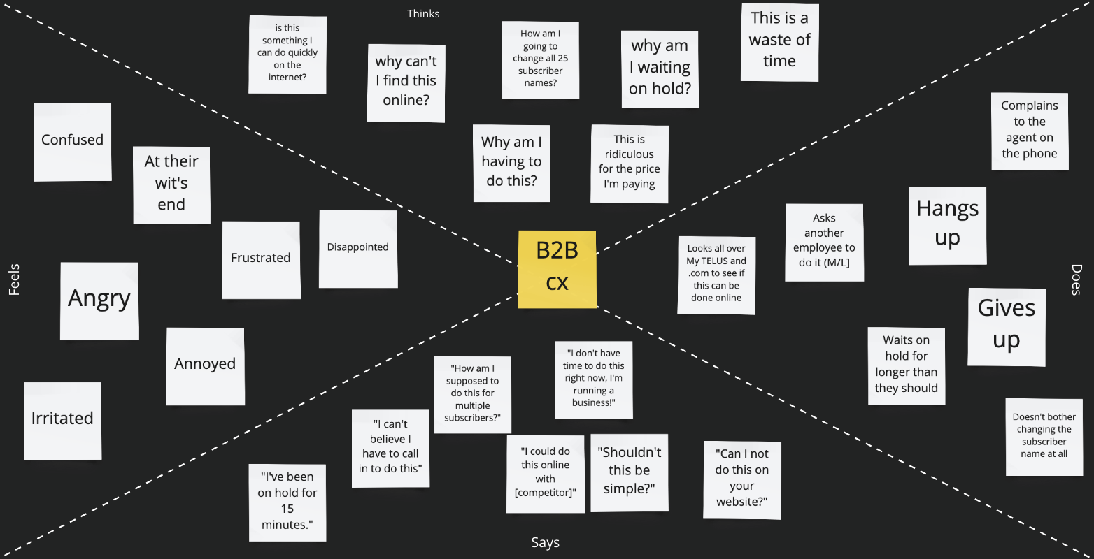
Empathy Map
We created an empathy map together based on some qualitative user feedback we had received. Yep, we made a separate one for consumer customers.

Customer Journey Map
This helped align us as a team on where the pain points where, areas of focus, and generally to get us into the head of our users. While the most glaring painpoint was the lack of this feature online, we also wanted to address the larger problem impacting call centres and our web rating for business folks.
I kicked off our discovery phase by creating a vision statement and some initial wires
Mabel works at Marigold Wines in the Accounting department. As the senior manager of the accounting team, she’s in charge of managing every team member’s mobility accounts on behalf of the company. Once a month she logs into My TELUS to pay the mobility bills, check on usage, and modify usage when needed. There are 50 people in her team and all of them have a mobile phone.
-excerpt from the business customer vision statement
✔️ Focus on driving customer awareness
✔️ One stop solution for quick completes
✔️ Ensure the solution addresses both business and consumer use cases

As the wires evolved and changed, so did our need for customer feedback
Table view of subscribers

Existing tile view of subscribers


Usability Testing was done and completed.
Customers had no major issues navigating either design
But they had more familiarity with the existing selector, and it would also mean less dev lift for something that already existed.


Since launching, there has been a 45% reduction in call volumes universally across both consumer and business spaces
There was also a completion rate of 85% for folks who arrived at the flow
But we didn’t have the number of pure visits we wanted, and unassisted shares could be improved
We want to bring awareness to the things our business customers can do online
The focus on this project was to improve wayfinding for our business customers. To drive up our “high value” activities that folks can perform online - and generally make it easier for customers to find this info in their TELUS account.
✔️ Business and consumer
There was a lack of awareness in our business segments. They could do a lot of things online, but engagement on these pages was low while call rates were high.
We wanted a workable solution
✔️ Quick lift, short timeline
✔️ Had to live on the Overview page
✔️ Something noticeable but not inundating on a page that already has a lot of CTAs
✔️ Temporary stop gap


Something important to find out was how we would prioritize these items smartly
I worked with our PO, developers, content writer to figure this out. Was it purely by volume? Would we know what people used the most? We landed on a solution together: we could display the highest call drivers first by volume, and those known to be popular with specific segment [wireless vs. wired]. And after launch we would gather data on individual customer usage, which would further customize the link display.
Testing within our larger design team
I played around with subtle visual treatment of the link. I knew this link had to exist front and centre at the top of the page.
But should it be text based, or a button? Is an overlay truly accessible given our guidelines and standards?


Improved numbers and data
1,940 unique visits to the overlay
31% completion rate
35% increase in unassisted shares, 4% increase monthly, 3% year-end target increase
Interesting findings: changing billing payment info and swapping out a SIM card are two most visited activities
There are next steps to further enhance and improve

Deep linking
Right now the links take users to the page containing the activity. But we want to explore the idea of dropping users directly into the page itself.
In context page help
Once we take users to these pages, what if someone needs further assistance? We’re exploring the idea of providing in-context help on the specific activity pages.
Extend to consumer segment
The consumer teams heard about the launch of Quick Links and want to leverage this solution on their side, to increase awareness and drive completion rates within their side of My TELUS.